Brand Guidelines
Type of Work
Brand Identity
Role
Creative Direction • Art Direction • Brand Strategy • Graphic Design • Animation • Logo Design & Identity • Copywriting
The Smartwealth Brand Identity consists of several parts that holistically compliment one another. Below are a series of guidelines that briefly touch on the different aspects of the brand system and their applications.
Rationale
The Smartwealth logo is minimal, neutral and contemporary. Its form follows function by taking into account the digital and financial aspects of the service. In addition, the composition had to be sincere and clearly legible for its application on all screen sizes while catering to a wide target audience.


A descriptor stating "by NBK Capital" was positioned on the bottom right of the "Smartwealth" logotype in order to emphasize the name of the service first and the parent company second. Another significant change was the lowercase logotype and the combinination of "Smart" and "Wealth" to form one word. This abolished hierarchy and established a unified whole.

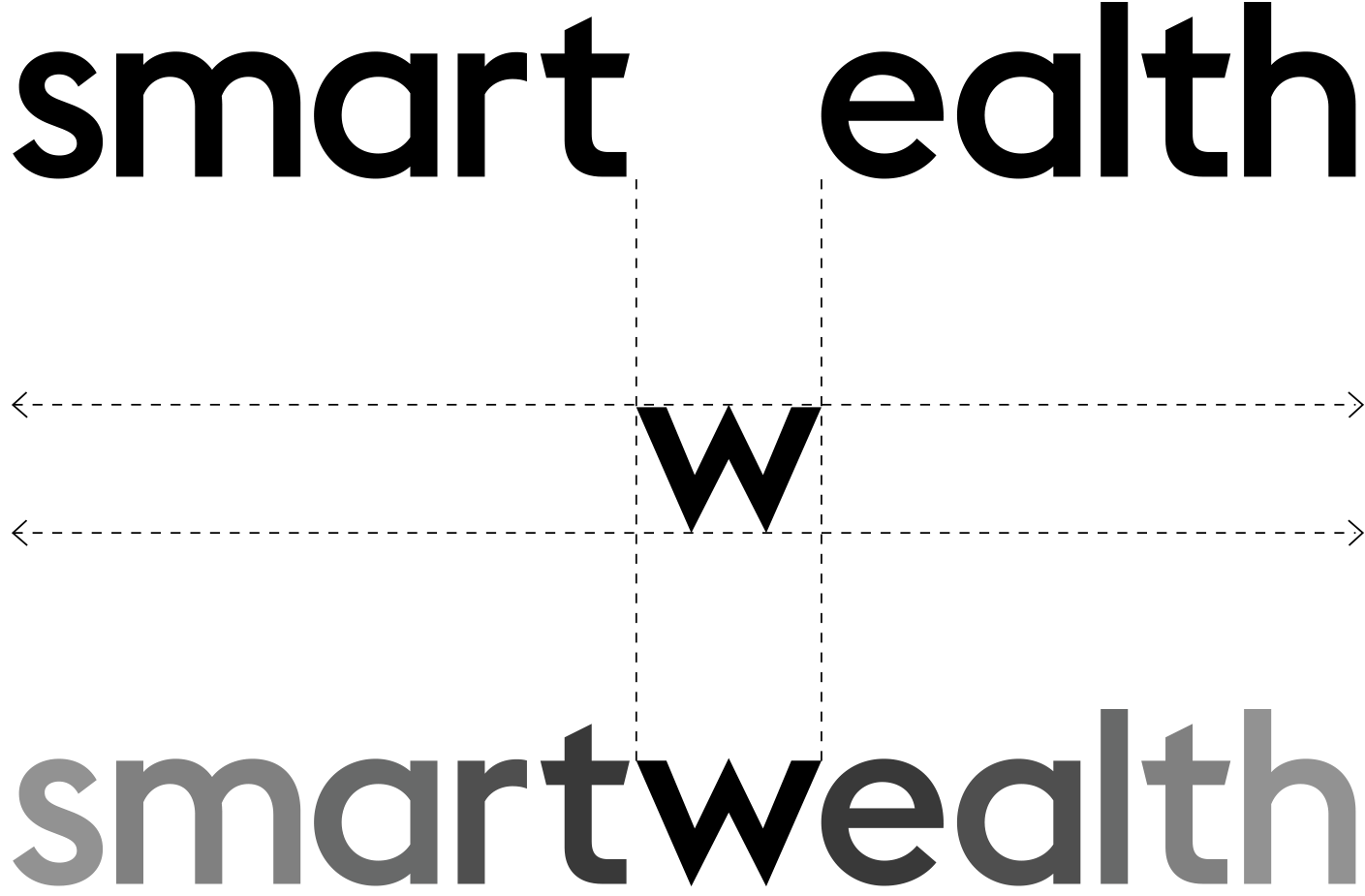
The ‘w’ played an important role in holding the logotype together. It’s symmetry and positioning enabled it to serve as a pivotal point flanked by the remaining characters. In addition, due to its sharp apex and striking traits, the ‘w’ contains a form of symbolism that resembles the movement of the stock market.
Construction
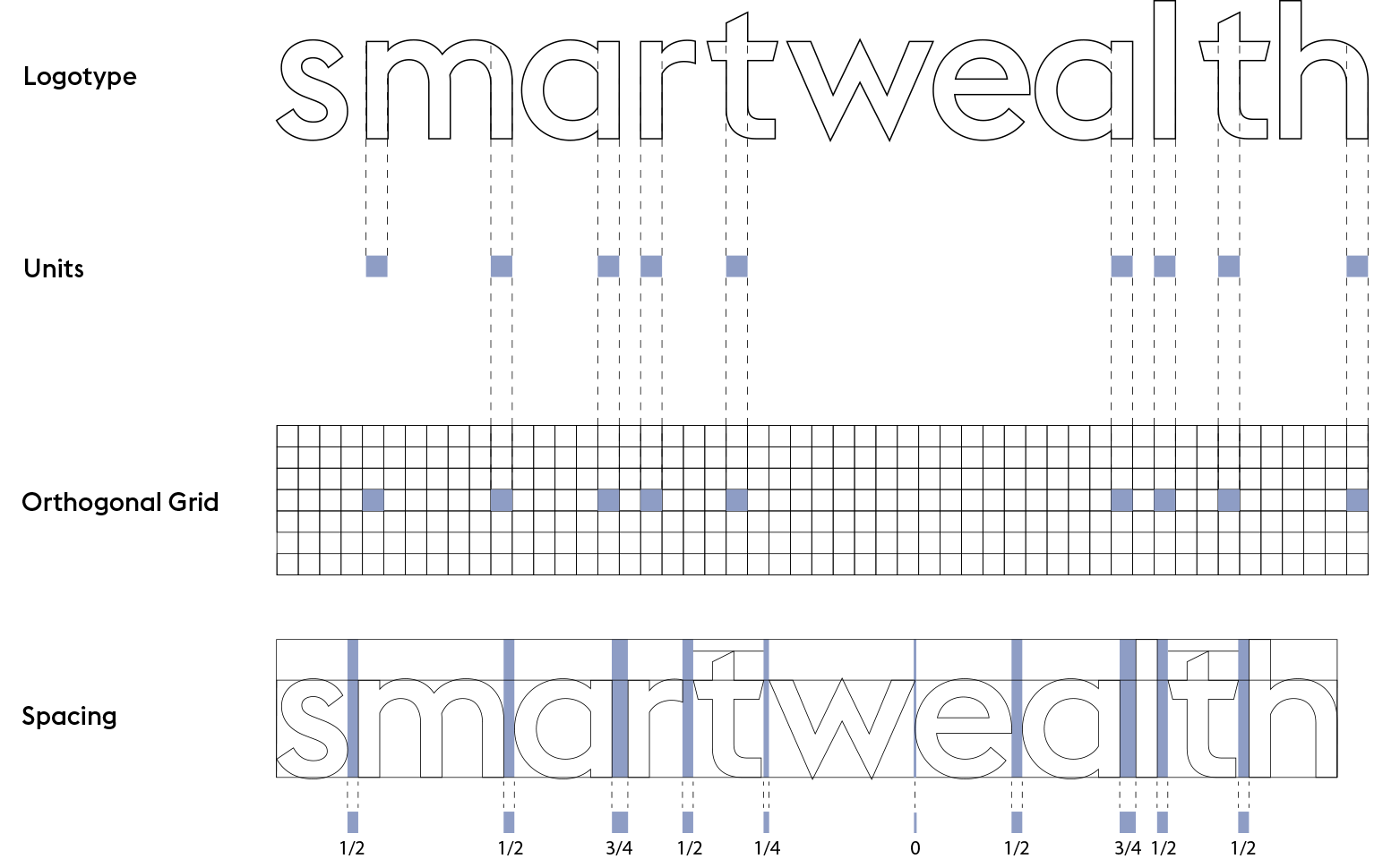
The Smartwealth logotype is constructed on an orthogonal grid composed of blocks called units. These square units take their dimensions from the stroke width of the typeface.
This process allows customized kerning that essentially creates the permanent relationship of characters in the logotype including proportional spacing between the characters.

Colour
The logo should be black on lighter backgrounds and white on darker backgrounds.
Scale
The logo changes size depending on the layout and its respective grid. There are three main size variations that are scaled by 50%. Since the logo uses the Euclid typeface family, each logo size variant has an equivalent font size (pts). This pts size system allows for the other typographic elements in a composition to be easily scaled with respect to hierarchy.

Boundary
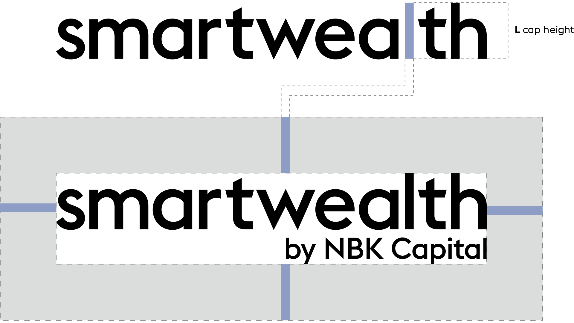
The logo must always contain a space around it equivalent to the cap height of the letter ‘L’.
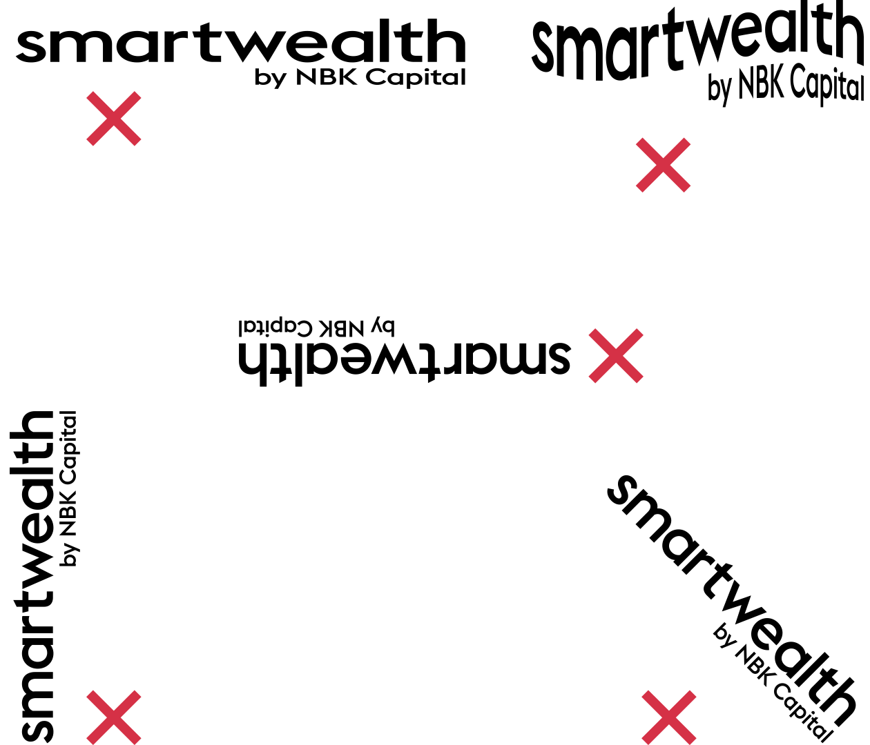
Placement & Usage
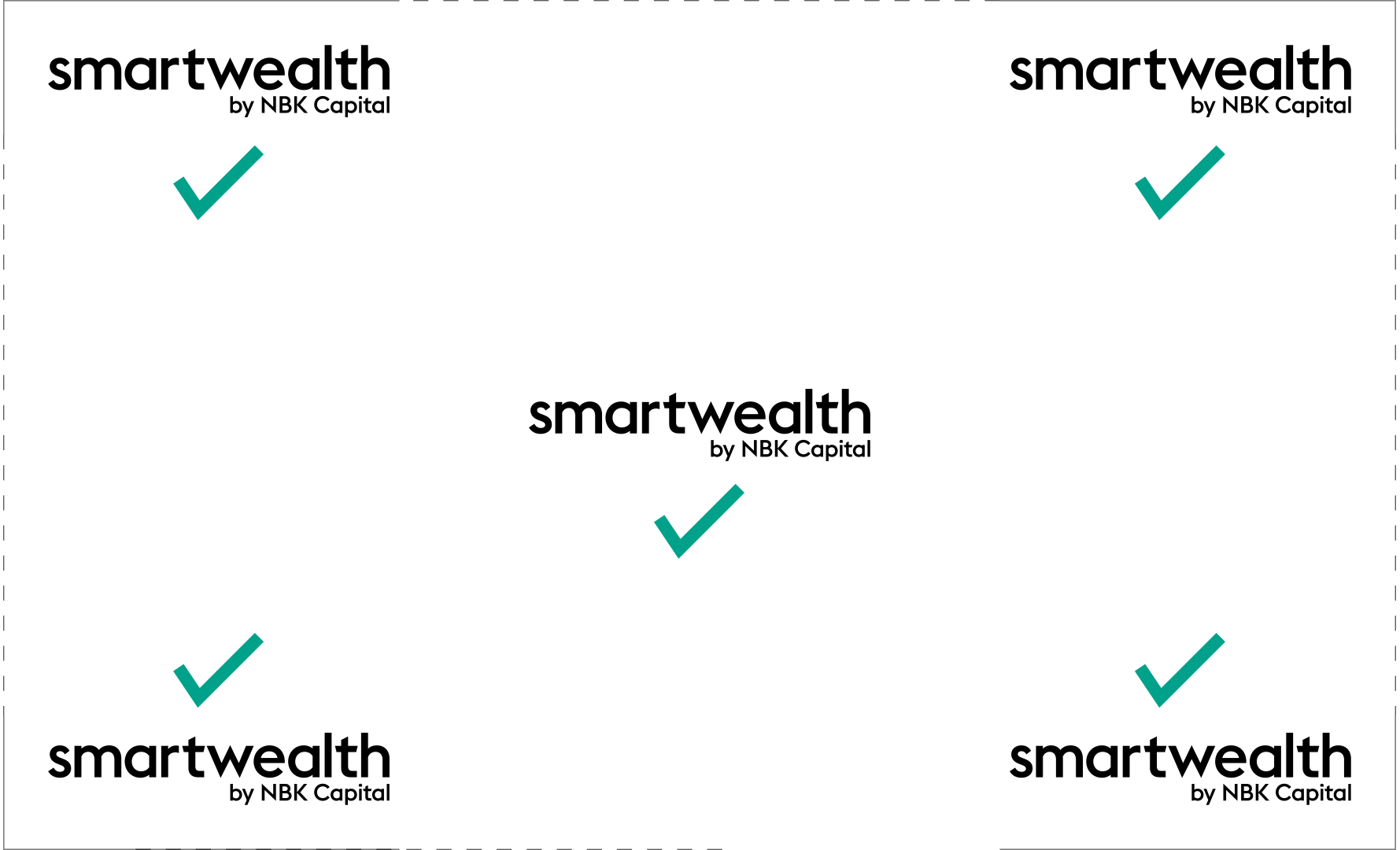
The Smartwealth logo is adaptive and can be placed freely within a composition. Certain transformations in size and orientation cannot be applied to the logo. The logo must not be stretched, distorted, rotated, mirrored, or altered in any way shape or form.
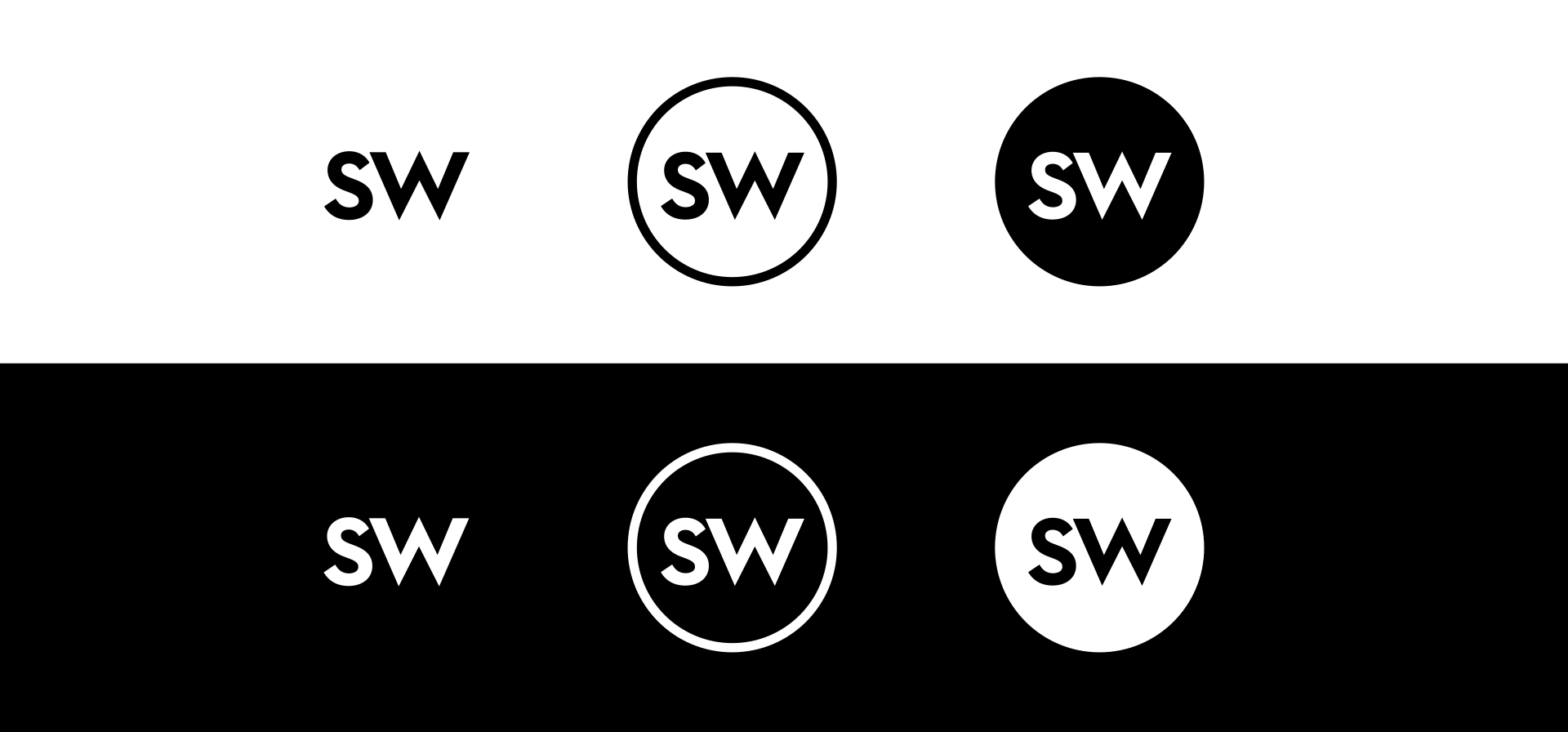
The following portrays the Smartwealth monogram which consists of the initials ‘SW’. It can stand alone or be inscribed within a circle. The monogram is either in black or white and can be linear or solid.
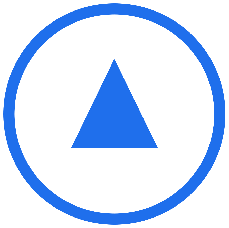
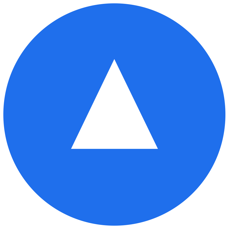
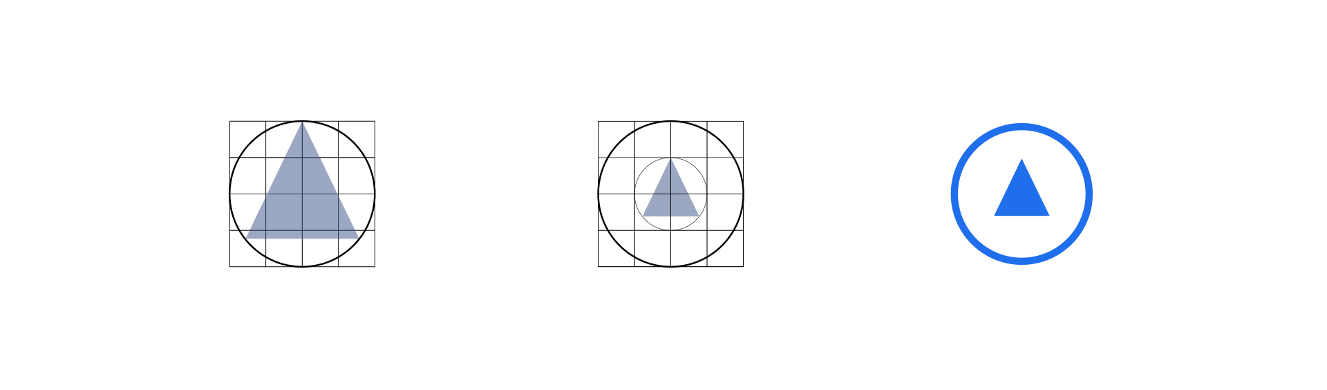
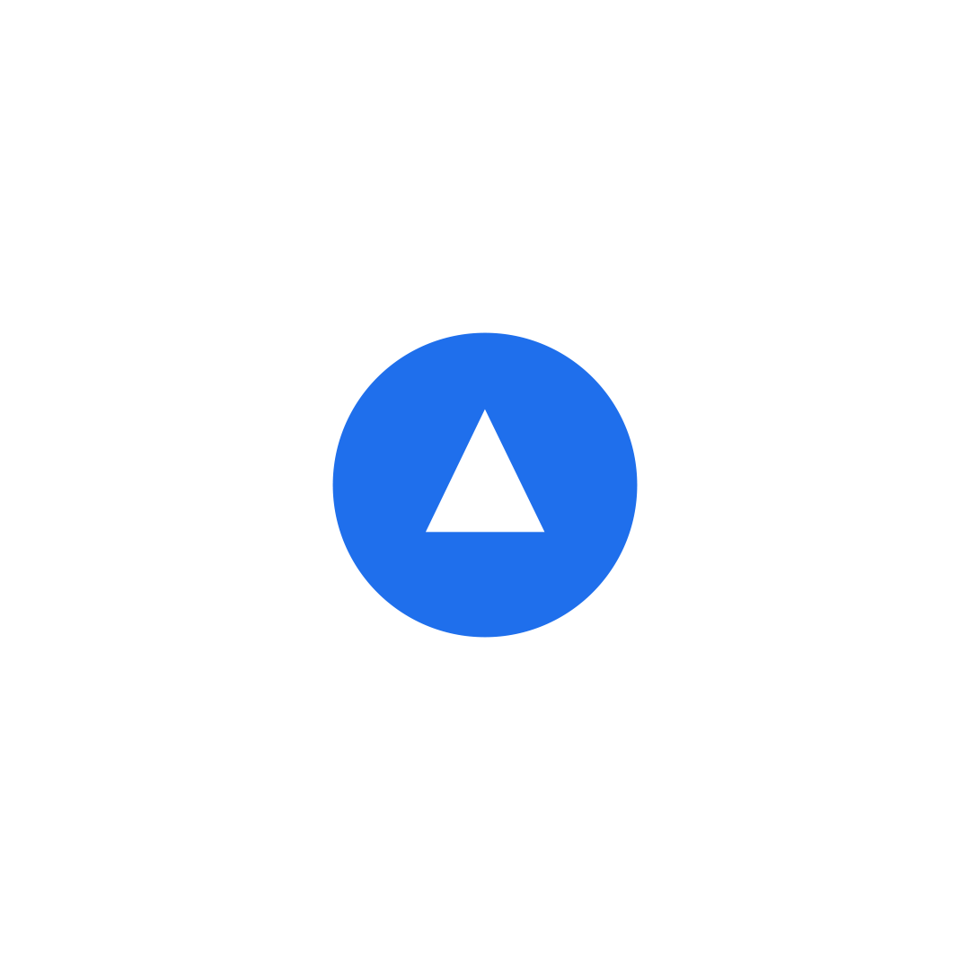
The Smartwealth icon is represented by an isosceles triangle encompassed by a circle. The triangle is a synonymous symbol in the investment and finance world as it represents an upwards motion and a positive stock market ticker - results that the Smartwealth service promises its customers on a long-term basis. Furthermore, associating a universally recognizable form such as the triangle with Smartwealth would only benefit and strengthen the brand overtime.
Construction
The Smartwealth icon construction is derived from the apex of the Smartwealth 'w' in order to maintain a direct homogeneous relationship with the logo itself.


Application
Texture
The brand icon can also be used to create a pattern through repetition and stacking. The outer-circle of the icon serves as a buffer zone between the triangles.

The end result is a new texture that acts as a light skin which adds slight ornament to otherwise dull surfaces.

Through the control and integrating of a few aspects including masking, size, opacity and gradient, the pattern expands its design capabilities into different compositions.
Masking
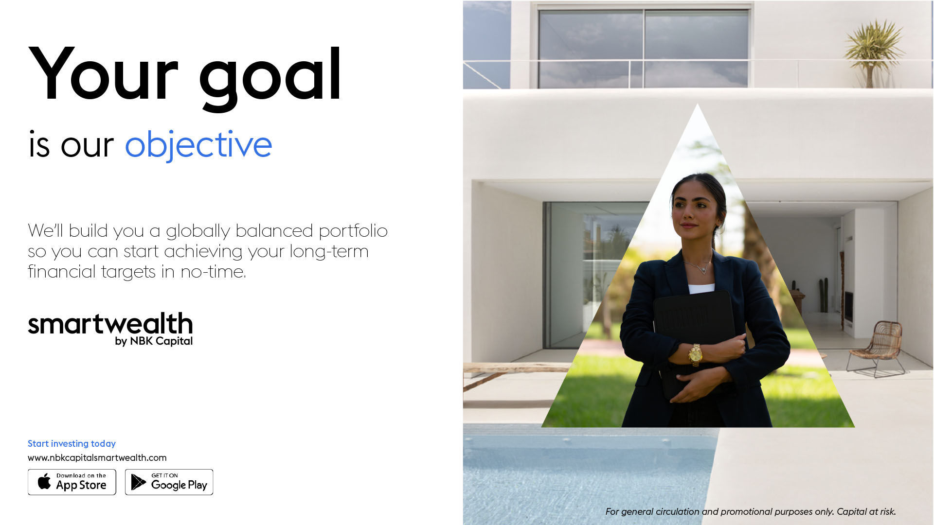
Another feature of the brand icon is its application as a masking device for image on image compositions. Image on image compositions are used to tell deeper visual stories. Since Smartwealth helps people achieve their financial goals, individuals can be portrayed within the brand icon mask, with their ambition, dream or goal placed behind them.
Retirement - Bucket List

Work - Dream Home

Student - Education

Being a service that relies heavily on written communication, the choice of typography was key to the brands clarity and legibility.

Styles
Seven font styles from the Euclid Flex typeface are used depending on the function and context of communication.

Pairings
It is important to maintain a system of pairings between font families in order to enhance coherence and functionality.

Hierarchy
It is important to organize typography in a hierarchical system according to relative importance or inclusiveness through scale and function depending on communication

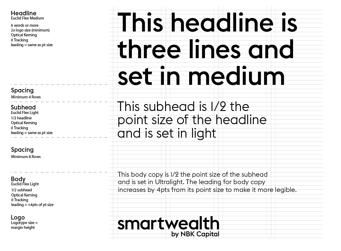
Numerals
Numerals are a recurring theme due to their use on diagrammatic and statistical forms of communication. Euclid Triangle numerals must always be used for their clear legibility. This makes them ideal for all purpose use. Euclid Flex numerals are for display purposes only.

Imagery
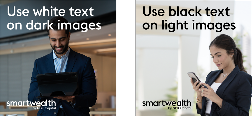
Typography should either be black on light imagery or white on dark imagery. When aligned with the logo, both typography and logo should be the same colour.
Guidance
In order to avoid discrepancies, typography must adhere to the brand system guidelines and steer clear from a few applications.

Do not use coloured typography (black or white only) Security Blue is the only exception (for CTA’s or Key messaging)

Do not use all caps

Do not over manipulate kerning or tracking

Do not make different levels of hierarchy the same weight

Do not make any level of hierarchy the same size or scale as another

Do not separate chunks of text outside the grid
Each grid is composed of columns, margins, gutters and rows that are derived from one another. A system was developed to organize elements within their respective compositions to maintain proportional qualities.

Column Breakdown
In order to maintain proportional structure regardless of ratio, a system was set in place that accomodates different composition sizes and mediums.

Ratio Setup
The below is an example of a 16:9 ratio grid setup that serves as an analogous method to provide order and proportion to the elements within the composition.

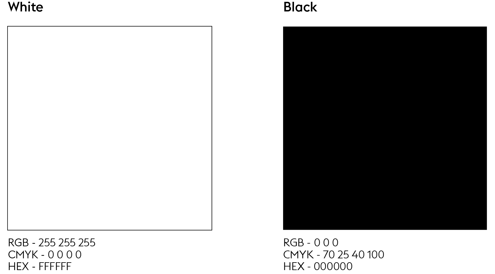
Primary Colours
The primary brand colours are white and black. They are used to provide consistency throughout all brand communications.
Secure Colour
Secure Blue is an important colour that is unique to Smartwealth and should be used for instances of interaction between the user and brand.

Secondary Colour
Secondary colours should be used throughout the system to maintain meaning and potency.

Shades
All colours can have white percentages added in order to provide lighter shades of each tone.

Taxonomy
Iconography consists of four categories. Each has its own purpose and functionality within the brand system depending on the form of communication being applied.
System Icons
Diagrammatic Icons

Illustrative Icons

Brand Icon
System Icons
System icons can be seen as badges and are used in the blog and newsletter to categorize the different sections of content. They are literal icons focusing on one main idea and are illustrated using a linear vector style while colour is added to the inside fill as a form of coding for the larger communication network.
Highlights

Financial Market News
Insight

Financial Articles
Learn

Financial Education
Wealth

Informational Videos
The arrow is an important icon in the system. It can stand alone or accommodate a CTA or headline and its use on a cover indicates that there are a series of slides to follow suit.
The arrow can also be utilised within the app to prompt the user on important actions and highlight the next steps. CTA’s are written in Euclid Flex - Semibold and are coloured in Secure Blue.
Application
Iconography can be combined with typography to create titles, buttons and compositions. These applications reinforce the narrative and provide functionality to their respective contexts. Below are examples of how system icons help categorize sections.
Newsletter Subheads


Blog Section Buttons
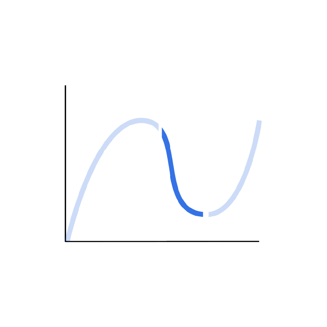
Diagrammatic Icons
Diagrammatic icons are used as a form of support to statistical claims. They can also be seen as infographics and come in three main forms - bar charts, pie charts and line graphs. Depending on context, diagrammatic icons differ in shape, size and style and should be composed of clean simple forms that can be easily interpreted.
Bar Chart

Pie Chart

Line Graph
Illustrative Icons
Illustrative icons are integrated into the system by being used as supporting elements. They are visual representations of their accommodating context. Story telling is made possible when a series of illustrative icons are used, which act as reinforcement to the copy. They are strictly drawn in a linear vector style.
Application
An example of illustrative icons that are literal representations of the statistics they are supporting.

Adding an icon that represents the copy creates context to the composition.

The coin (circle) is an important and recurring symbol in the Smartwealth system since it denotes investing. It is heavily incorporated into the brands visual language and is usually animated rolling or turning on an axes. It is ideal reinforcement for headers, CTA’s, logos and animations.

Brand Icon
The Smartwealth Brand Icon can be used for symbolic, functional or aesthetic purposes.
When combined with the monogram, the brand icon can be used as a button to the website.

When combined with the coin icon the brand icon can represent wealth (as shown in the brand awareness video).
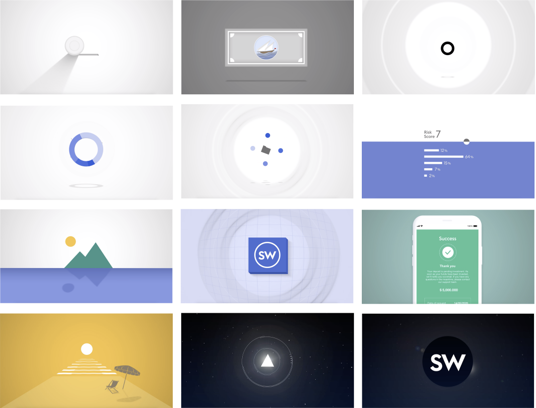
Simple geometric shapes form the foundation of Smartwealth’s branded illustration aesthetic. Although the main and predominant style is two-dimensional, three-dimensional elements are sometimes integrated to diversify visual communication.
Principles
Simple and efficient

Do more with less by creating uncomplicated compositions.
Easy to understand

To educate through clear telegraphic images.
Inspiring through metaphor

Embracing realism to create compelling images.
Construction
Illustrations used for the brand are constructed using axial relationships to remain analogous.


In animation, repetitive shapes are applied in succession to create a harmonious flow for the eye from one scene to the next. The circle, being an important shape in the Smartwealth brand, was used in this regard for the brand awareness video.
Background
From humble beginnings to a leading FinTech service in Kuwait, Smartwealth first embarked on its journey as a startup before being acquired by NBK Capital, the investment subsidiary of the National Bank of Kuwait. Although this was a milestone for both brand equity and internal resources, it generically placed Smartwealth under a conglomerate umbrella, and inadvertently quelled its recognition.
Problem
Smartwealth adopted NBK Capital's brand identity, making it visually indistinguishable from the other services. This monotonous "one size fits all" approach not only overshadowed the purpose of the platform, but also hindered it from freely communicating its product and establishing its own identity.
Another significant issue was imposed by the growing number of similar platforms released by competing local banks. This threatened potential market share and pushed Smartwealth further into the peripheries. The lack of clout, online presence and overall brand recognition became evident.
Solution
A shake-up from the bottom up was needed to revive Smartwealth's innovative personality. To differentiate it from the crowded marketplace, a re-structure of the entire marketing and brand strategy was conducted. This included extensive research into the local financial sector, the existing client base and the acquisition of potential customers.
Based on those findings, an omni-channel marketing strategy was devised that encircled a fully fledged eco-system. With these fundamentals aligned, a new corporate identity was developed that addressed the needs of the company. This consisted of a diligently assembled +100 page document encompassing all forms of communication and design.
Company & Title
Company: NBK Capital
Title: Senior Officer - Marketing and Creative Design
Credits
Karim A. Sallman • Creative Direction, Art Direction, Concept Development, Motion Ideation, Graphic Design, Animation, Logo & Identity, Copywriting, Marketing Strategy
Why stop here?
Check out the next project.
Get in touch.
This website includes work created by Karim A. Sallman for clientele based in the MENA region that were contracted by multinational advertising agencies. The published projects are for portfolio purposes only and are not intended for any form of personal monetary capitalisation. This website aims to exhibit Karim A. Sallman's professional capabilities and skill sets.
All aspects of work including corporate identity, animation, video production, graphic design, creative direction, art direction, copywriting and marketing were solely designed and executed by Karim A. Sallman unless stated otherwise in the Credits section found in the Project Info. segment placed in the footer of each project page.
© 2024 k.a.sallman • Online Portfolio
The information contained in this website may not be published, broadcast, rewritten, or redistributed.