Motion Guidelines
Type of Work
Motion Branding
Role
Creative Direction • Art Direction • Brand Strategy • Graphic Design • Animation • Logo Design & Identity • Copywriting
Movement plays an essential role in Smartwealth's brand expression. Below are a series of guidelines that touch on the different aspects of the motion system and its applications.
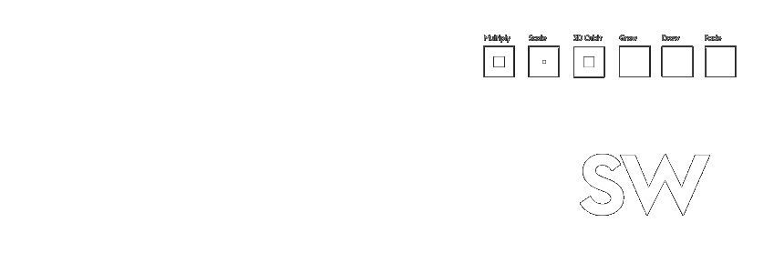
The motion system is built from twelve fundamental motion states that can be applied individually or combine to form a kinetic language.
Masking is a recurring aspect in the system. It creates a window of vision that enhances aesthetics and provides functionality to several components.
The Smartwealth logo is brought to life through the application of motion states. Adding several states in sequential order creates unique alternative compositions that can be used in different contexts.
Iconography and logo variants can combine by using motion states as transitions.
Motion gives typography another layer of articulation that allows it to communicate in a dynamic manner while accentuating hierarchical properties.
Application
Applying movement to type requires a masking process in addition to selecting the corresponding movements.
Movement
There are only three motion states applied to typography depending on their format.
Candlestick - Display Motion
The most dynamic application of motion to typography. This state is used for introductions and applied to Headlines only.
Ticker Up - Transitional Motion
Upward motion allows typography to smoothly transition in and out. This state is applied to both Headers and Subheads only.
Fade In/Out - Generic
A simple form of appearing and disappearing, This state is generic and can be applied to all copy including Body and Descriptive Copy.
Headline
The headline is the primary subject and requires attention grabbing movement. Candlestick Wave is used to introduce the type while Ticker Up is the transition out.
Subhead
The subhead is the secondary subject which usually reinforces the headline. Fade In/Out or Ticker Up can be used depending on context.
Body Copy
The body copy is text heavy and must use Fade In/Out to appear and disappear modestly within a composition.
Composition
When a headline, subhead and body copy are used in a composition they must always appear in consecutive order based on their hierarchy. A subhead paired with a headline is required to use Fade In/Out.
Transitions
Ticker Up and Fade are used as transitional motions in typography. They allow type to smoothly appear and disappear, as well as switch in and out.
Ticker Up makes switching between statements ideal.
Changing languages in a headline, subhead or body is made possible by using either motion state.

Motion Usage
Certain movements, orientations and transformations cannot be applied to typography.
Typography always moves up.
Typography never moves downnwards or side to side.
Any form of rotation, skewing or movement outside of the motion state guidelines are not allowed.
Taxonomy
Iconography is animated through subtle and systematic motions. Each category utilises different motion states that best suits their style and purpose.
System Icons
System icons are used in communication channels (blog, newsletter, emails) . Simple movements are applied to animate their characterisitcs to grab attention.
Four motion states can be used to animate System Icon properties.

The arrow is an important icon in the system. Applying motion states to the arrow enhances its signaling quality and aids in directing the user. The arrow is animated into the composition from the left and stretches the breadth of the layout going right. It can stand alone or accomodate a CTA or headline.
Diagrammatic Icons
Diagrammatic icons are used as infographics to accommodate statistics. Motion states are applied to create simple intro and outro movements.
Four motion states can be used to animate System Icon properties.
Illustrative Icons
Illustrative icons are integrated into the system by being used as supporting visuals. They are strictly drawn in a linear vector style.
Illustrative icons are diverse in their movement and use up to six motion states.
Can be applied as a way of revealing an icon or to animate characteristics.
An illustration can become playful with the application of simple motion.
Telling a story with a series of illustrative icons is made possible.
Application
Iconography can be combined with typography to create compelling compositions. These applications reinforce the narrative and provide functionality to their respective contexts.
Combination with headlines to create categorical visual representation.
Combination with CTA’s and headers to reveal statements.
Combination with typographic composition to provide context.
Brand Icon
The Smartwealth brand icon triangle can be applied as a pattern or texture. Textures are animated to produce free flowing scenes that can stand alone or be applied to frames as a masking device.
Illustrative icons can use up to three motion states.

Smartwealth Brand Icon
The Smartwealth monogram can be integrated into the texture to serve as an opening frame, end frame or as a loading frame.
Styles
Illustrations are integrated into the system by being used as supporting visuals or as infographics. They can either be in a solid vector or three-dimensional style. Click here to see some examples
Illustrations are diverse therefore there are no specific motion states attributed to their movement.
Solid Vector
Three-Dimensional

Application
Illustration can be combined with other elements in the system to create compelling compositions. These applications reinforce the narrative.
Combination with headlines to provide aesthetic context.
Combination with diagrammatics to create contextualised infographics.
Combination with composition to create subject representation.
The Smartwealth Brand Awareness video is a perfect example of how simple illustrated geometric shapes can come together to tell a story through the application of motion states.

Transitions are used to smoothly move from one frame to the next. The motion states can be applied to an object or as a mask. Transitions are applied on the opening frames, end frames or in-between frames in a composition.
Three motion states are used as transitional movements.
Title cards are simple templates that allow the communication of seasonal events and the announcement of blog posts. A headline is always present at the top of the card while the placement and masking of the image changes.
Four motion states are used as transitional movements.
Background
From humble beginnings to a leading FinTech service in Kuwait, Smartwealth first embarked on its journey as a startup before being acquired by NBK Capital, the investment subsidiary of the National Bank of Kuwait. Although this was a milestone for both brand equity and internal resources, it generically placed Smartwealth under a conglomerate umbrella, and inadvertently quelled its recognition.
Problem
Smartwealth adopted NBK Capital's brand identity, making it visually indistinguishable from the other services. This monotonous "one size fits all" approach not only overshadowed the purpose of the platform, but also hindered it from freely communicating its product and establishing its own identity.
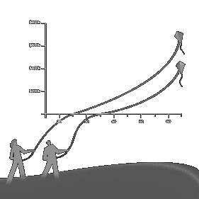
Another significant issue was imposed by the growing number of similar platforms released by competing local banks. This threatened potential market share and pushed Smartwealth further into the peripheries. The lack of clout, online presence and overall brand recognition became evident.
Solution
A shake-up from the bottom up was needed to revive Smartwealth's innovative personality. To differentiate it from the crowded marketplace, a re-structure of the entire marketing and brand strategy was conducted. This included extensive research into the local financial sector, the existing client base and the acquisition of potential customers.
Based on those findings, an omni-channel marketing strategy was devised that encircled a fully fledged eco-system. With these fundamentals aligned, a new corporate identity was developed that addressed the needs of the company. This consisted of a diligently assembled +100 page document encompassing all forms of communication and design.
Company & Title
Company: NBK Capital
Title: Senior Officer - Marketing and Creative Design
Credits
Karim A. Sallman • Creative Direction, Art Direction, Concept Development, Motion Ideation, Graphic Design, Animation, Logo & Identity, Copywriting, Marketing Strategy
Why stop here?
Check out the next project.
Get in touch.
This website includes work created by Karim A. Sallman for clientele based in the MENA region that were contracted by multinational advertising agencies. The published projects are for portfolio purposes only and are not intended for any form of personal monetary capitalisation. This website aims to exhibit Karim A. Sallman's professional capabilities and skill sets.
All aspects of work including corporate identity, animation, video production, graphic design, creative direction, art direction, copywriting and marketing were solely designed and executed by Karim A. Sallman unless stated otherwise in the Credits section found in the Project Info. segment placed in the footer of each project page.
© 2024 k.a.sallman • Online Portfolio
The information contained in this website may not be published, broadcast, rewritten, or redistributed.