Brand System
Role
Brand Strategy • Creative Direction • Art Direction • Graphic Design • Animation • Logo Design & Identity • Copywriting
Type of Work
Brand Identity
Smartwealth, Kuwait's leading FinTech service by NBK Capital, decided to revamp their brand strategy in order to ensure sustainable future growth.
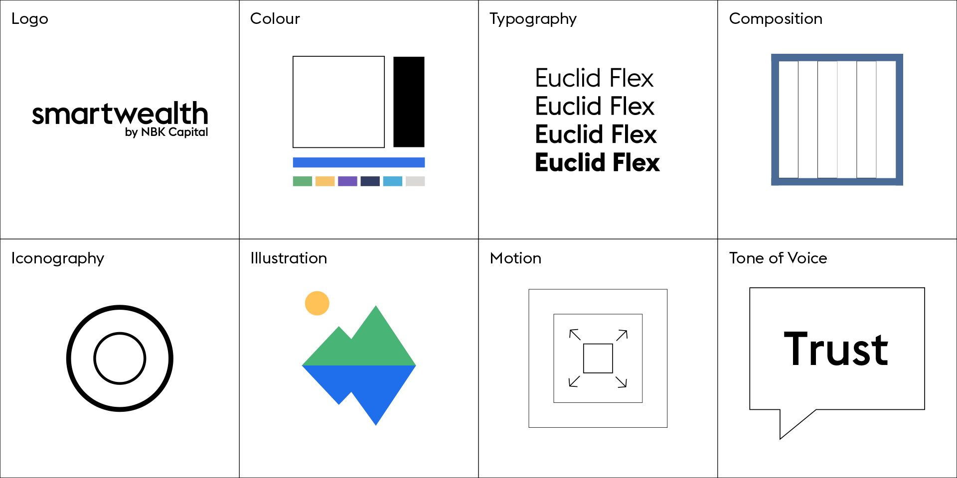
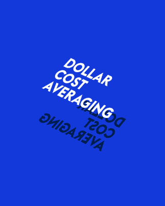
The brand system consists of eight core parts and was designed to be simple, flexible and recognizable.
Motion
As homage to the stock markets dynamic nature, movement was infused into Smartwealth's brand expression and communication style.
A motion system consisting of twelve fundamental states was developed and applied throughout the brand system to form a kinetic language.
Brand Awareness Video
The new identity launched with an awareness video that clearly describes the service and its benefits in a comprehensive and visually appealing manner.
A minimalist approach was used to amplify the simplicity of the service which gave the video an engaging and timeless attribute that can represent the brand throughout the ages.
Logo
The uplifted Smartwealth logo was designed to be minimal, neutral and contemporary. Its form follows function by taking into account the digital and financial aspects of the service, making it clearly legible for its application on all screen sizes while catering to a wide target audience.
The lowercase logotype abolished hierarchy and established a unified whole. The descriptor positioned on the bottom right emphasized the service first and the parent company second.
The ‘W’ played an important role in holding the composition together. It’s symmetry and positioning enabled it to serve as a pivotal point flanked by the remaining characters.
Monogram
The Smartwealth monogram is a vital branding element. It consists of the initials ‘SW’ and can stand alone or be inscribed within a circle.
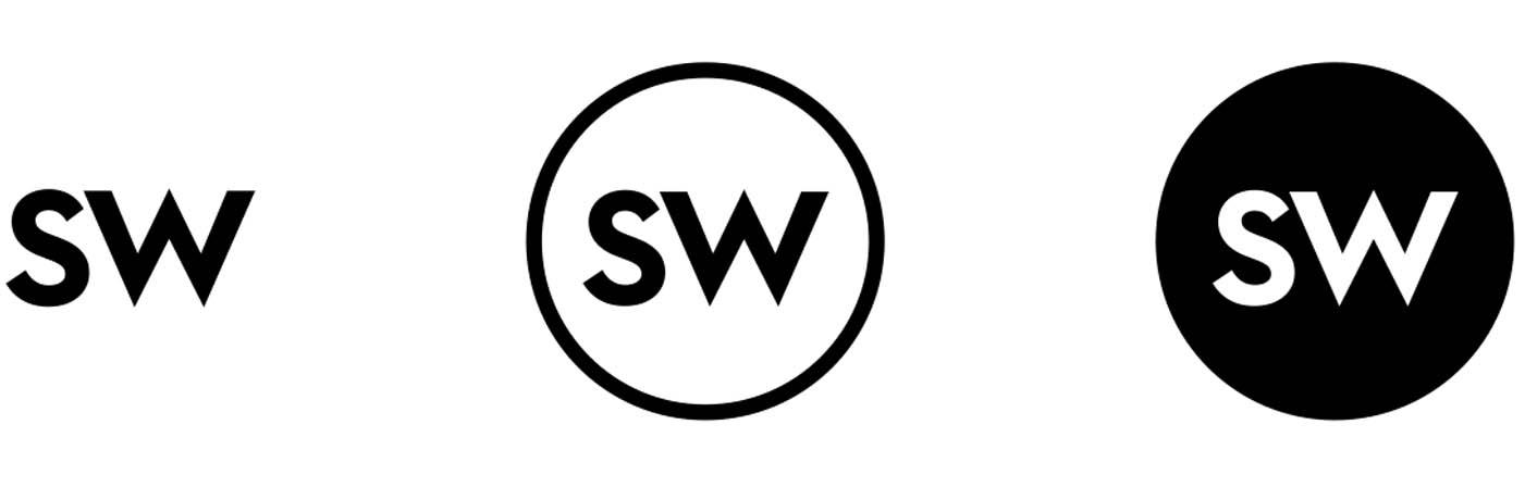
Being an abbreviated form of the logo, the monogram is applied across all forms of communication and products.
Application - Intro Screen
Brand Icon
The brand icon is represented by an isosceles triangle encompassed by a circle. It is derived from the apex of the 'w' in order to maintain a direct homogeneous relationship with the logo.
The upright triangle is a synonymous symbol in the investment realm as it represents a positive stock market ticker. Associating a universally known form such as the triangle would strengthen the brand's recognition overtime.
Masking Application
The brand icon can be applied as a masking device on compositions to tell deeper visual stories.
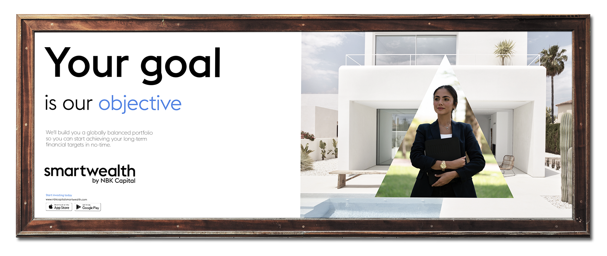
Print - Billboard
Digital - OOH Screen
Texture Application
The brand icon can also be used to create a pattern through repetition and stacking. The end result is a texture that acts as a light skin which adds slight ornament to otherwise dull surfaces.
By controlling a few visual properties and integrating branded elements such as the monogram, the pattern expands its design capabilities into different mediums and functionalities.
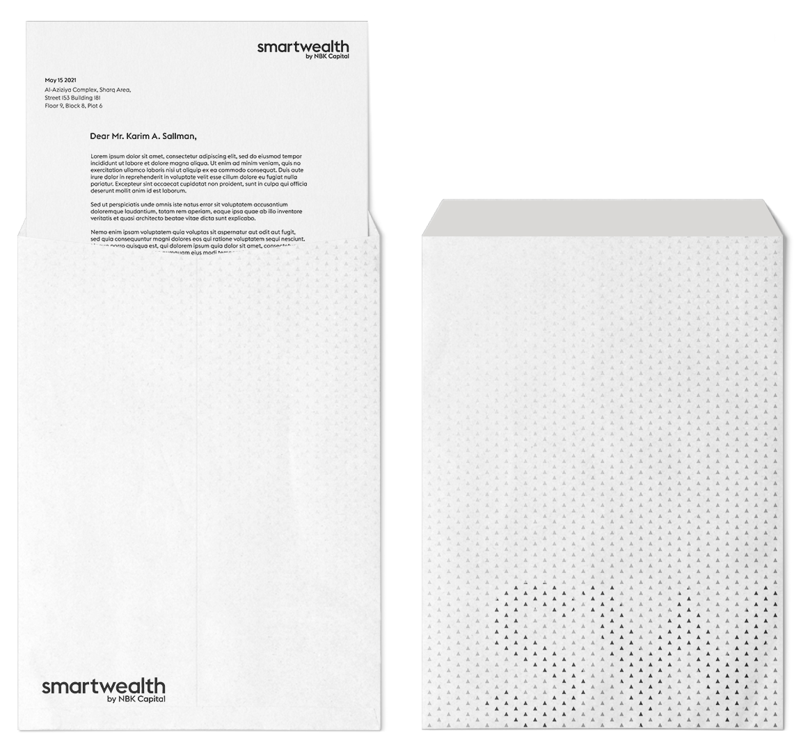
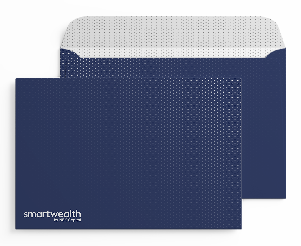
Stationary Items - Ornamental Aesthetic
Digital - Functional Aesthetic (Loading / Transitionary Screen)
Typography
Being a service that relies heavily on written communication, the choice of typography was key to the brands clarity and legibility.

Hierarchy
The font styles are used in a pairing system in order to maintain and enhance hierarchical coherence between head, subhed and body copy.
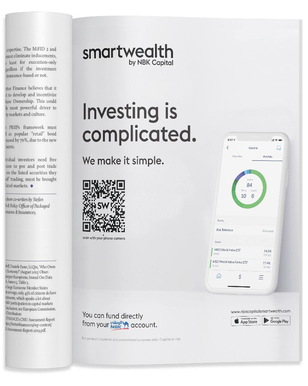
Marketing - Print Ad
Marketing - Online Ad
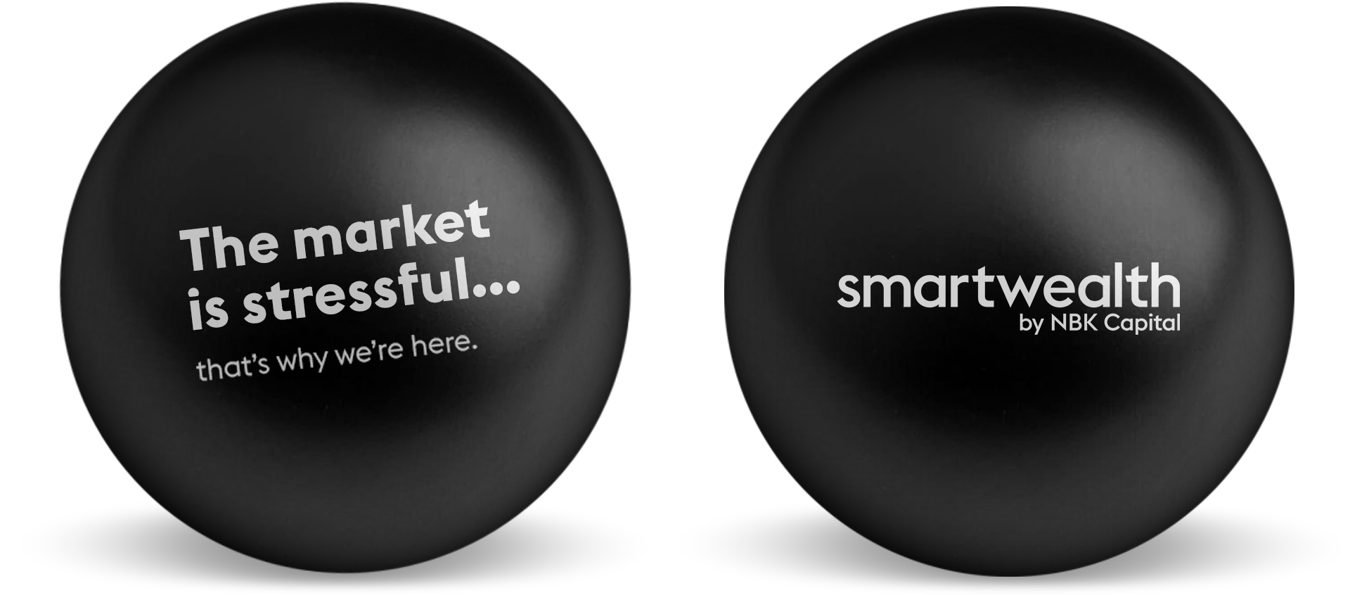
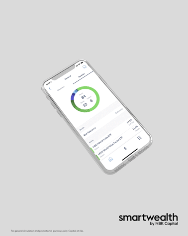
Merchandise - Giveaways

Digital Content - Universal Footer
Iconography
Different categories of iconography are applied throughout the brand system to reinforce narratives, organize information and provide functionality to their respective contexts.

Illustrative Icons
Illustrative icons are integrated into the system by being used as supporting visuals or as an animated series to tell a story.
Application - Get Started Carousel
Diagrammatic Icons
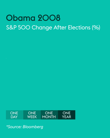
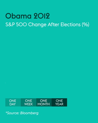
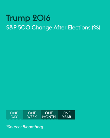
Diagrammatic icons are used as infographics to accommodate statistics.
Portfolio Performance - Line Graph
System Icons
System icons are used throughout Smartwealth's communication channels (blog, newsletter, emails) to organize the different categories of content.

Learn - Financial Education

Insights - Financial & Market Articles

Highlights - Financial & Market News

Wealth - Informational Videos
Blog - Title & Section Buttons
Illustration
Simple geometric shapes form the foundation of Smartwealth’s illustration aesthetic.


Principles
Inspiring through metaphor

Embracing realism to create compelling images.
Easy to understand

To educate through clear telegraphic images.
Simple and efficient

Do more with less by creating uncomplicated compositions.
Social Media
An ongoing series of content was created to promote Smartwealth's brand and service.
Educational Content - Financial Literacy
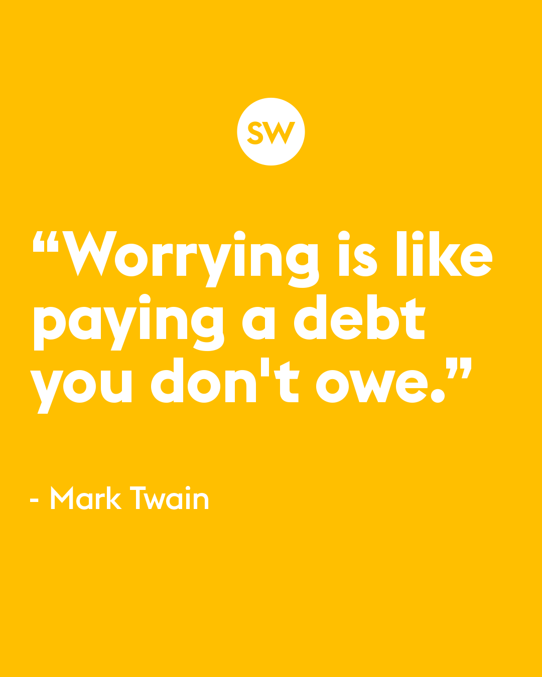
Value Content - Quotes
Seasonal Content - NY 2021
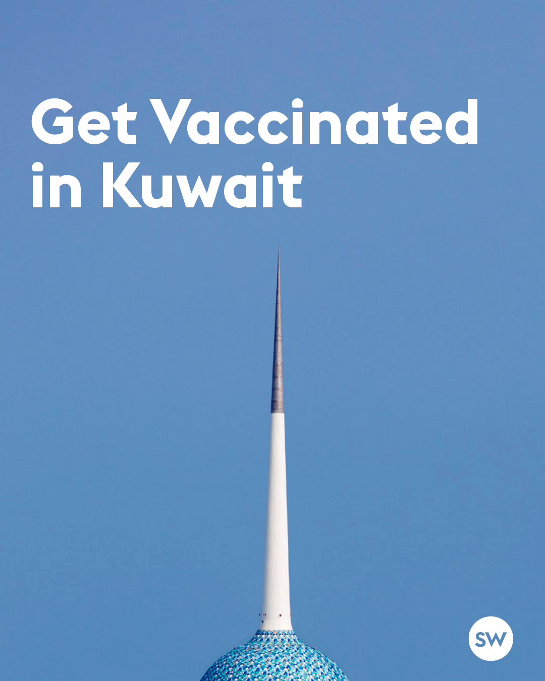
CSR Content - Covid Vaccinations
Educational Content - The Bigger Picture
Educational Content - Compound Interest


Informative Content - Financial Lifestyle
Background
From humble beginnings to a leading FinTech service in Kuwait, Smartwealth first embarked on its journey as a startup before being acquired by NBK Capital, the investment subsidiary of the National Bank of Kuwait. Although this was a milestone for both brand equity and internal resources, it generically placed Smartwealth under a conglomerate umbrella, and inadvertently quelled its recognition.
Problem
Smartwealth adopted NBK Capital's brand identity, making it visually indistinguishable from the other services. This monotonous "one size fits all" approach not only overshadowed the purpose of the platform, but also hindered it from freely communicating its product and establishing its own identity.
Another significant issue was imposed by the growing number of similar platforms released by competing local banks. This threatened potential market share and pushed Smartwealth further into the peripheries. The lack of clout, online presence and overall brand recognition became evident.
Solution
A shake-up from the bottom up was needed to revive Smartwealth's innovative personality. To differentiate it from the crowded marketplace, a re-structure of the entire marketing and brand strategy was conducted. This included extensive research into the local financial sector, the existing client base and the acquisition of potential customers.
Based on those findings, an omni-channel marketing strategy was devised that encircled a fully fledged eco-system. With these fundamentals aligned, a new corporate identity was developed that addressed the needs of the company. This consisted of a diligently assembled +100 page document encompassing all forms of communication and design.


Company & Title
Company: NBK Capital
Title: Senior Officer - Marketing and Creative Design
Credits
Karim A. Sallman • Creative Direction, Art Direction, Concept Development, Motion Ideation, Graphic Design, Animation, Logo & Identity, Copywriting, Marketing Strategy
Why stop here?
Check out the next project.
Get in touch.
This website includes work created by Karim A. Sallman for clientele based in the MENA region that were contracted by multinational advertising agencies. The published projects are for portfolio purposes only and are not intended for any form of personal monetary capitalisation. This website aims to exhibit Karim A. Sallman's professional capabilities and skill sets.
All aspects of work including corporate identity, animation, video production, graphic design, creative direction, art direction, copywriting and marketing were solely designed and executed by Karim A. Sallman unless stated otherwise in the Credits section found in the Project Info. segment placed in the footer of each project page.
© 2024 k.a.sallman • Online Portfolio
The information contained in this website may not be published, broadcast, rewritten, or redistributed.